Colour Schemes and Graphic Design
Picking a base colour and colour
scheme is one of the first decisions you will make starting a new
business. If you have an existing website and plan to renovate, or build new,
it is the right time to change your colour scheme to create a fresh new look. Colours influence graphic design and the
image your brand, logo and website projects. The first thing a graphic
designer needs to know is your main colour or preferred colour scheme.
Our graphic designers use several colour software programs.
In order to get the right look and feel, designers at a minimum, need
to know your preferred base colour. Every base colour has
numerous shades and complimentary colours so the best way to get your exact
colours is to give us your colour RGB numbers. There is a great tool that is
free for finding RGB numbers, colours and complimentary colours. Picking the exact colours you want is easy
with the Adobe RGB Color Wheel.
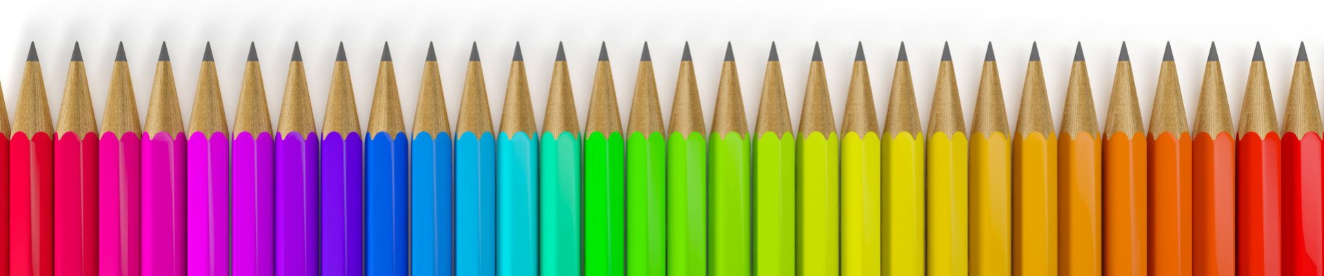
Colour schemes are a matter of personal choice, but certain
colours may be more common in different industries. The colours of your logo and web design should
evoke a positive feeling with potential customers.
The Influence of Colours
The customer age and gender demographics you
are targeting can be influenced positively with the right colour
scheme. Colours have a subconscious effect on potential
customers. Here are some of the different
ways colours can have a positive influence in a web site colour
scheme:
Red projects energy, passion, power and a call to
action. Red is frequently used in the restaurant and food industries. Red can
also be an accent colour to draw the customer’s attention to a brand logo, or a
special offer, encouraging them to buy now. Some industries, like financial services,
shy away from using red which has a negative connotation in their industry, as
in "running in the red”.
Pink is used by companies to accent
a feminine type website. Pink conveys sensitivity, romance, tenderness and
femininity. Companies with female demographics use pink to message potential
customers that their products and services are for women.
Yellow projects hope, happiness and positivity, or caution. Web
sites in the construction, fire prevention and safety industries often use colour
combinations with yellow and black. One thing to keep in mind with yellow is
that some shades are hard to work with and display differently on different computer
monitors. Yellow can also be used as a
heavy accent colour to emphasize a special feature or offer.
Green emits emotions of growth, renewal , rebirth and a signal to go. Green is the colour of nature, grass, plants
and trees. Medical related industries often
use green to project an image of healing and being nature friendly.
Blue projects serenity,
intelligence, responsibility, stability, trust and power. Blue is used more than any other colour in
brand logos. Websites in industries such as banking, financial services, real
estate and insurance often use blue-based colour schemes.
Purple draws out feelings of luxury,
mystery, loyalty, quality and inner
peace. Companies selling high ticket
items use purple to project an image of luxury and exclusivity.
Orange is used to emphasize creativity, enthusiasm,
vibrancy and high energy. Like red, orange is used as an accent colour to catch
a customer’s attention and prompt an action.
Brown is an earthy colour that implies
wholesomeness, honesty, stability, dependability, warmth and old fashioned
quality. Brown is often combined with green colours for an organic and healthy
image.
Black can add a level of
elegance, sophistication, power, prestige and exclusivity. Black is a versatile colour that can be easily
combined, or contrasted, with other colours. It can also be used in a website to
emphasize selling points and offers.
Grey adds formality,
dependability and a subdued, serious professionalism. Conservative companies will use grey to
convey the image of stability and dependability. Grey is primarily used as an accent colour.
White is primarily used as a website background
colour to project a pure, simple, clean and modern image that contrasts with
other colours. A white background is especially eye appealing with a minimalist
design.
Colours Scheme Questions?
A colour scheme can make or break a brand. Colour schemes
are the visual foundation that helps deliver your message and prompt potential
customers to make a decision. If you have questions about colour schemes give
us a call. You can also schedule a free consultation on your
website colour scheme.